To choose a coastal phone case, decide whether you want it to carry a place, a marine subject or a shell-like texture. Place graphics feel personal and nostalgic. Marine illustrations tell a small nature story. Shell and water-inspired surfaces behave more like abstract accessories. That distinction is more useful than searching for one universal “beach” color.
Choose the kind of connection you want
A coastal case can remind you of somewhere specific, express interest in ocean life or simply bring light, movement and mineral color into an outfit. Those are different jobs. A state or destination graphic is read for meaning first. A turtle, whale or reef scene is read as an image. Iridescent shell texture is read as color and surface before anyone names the source.
Start by asking what you would still enjoy in winter, at work and away from the shoreline. If the answer is the memory of a place, choose a restrained travel graphic. If it is the animal or ecosystem, let the subject lead. If it is the shifting color itself, an abstract shell design will have the longest visual life.
Place graphic: keep the reference specific
The Florida Sunshine Phone Case uses a cream ground, orange lettering and a license-plate-like frame. It suggests road trips and warm light without assembling a full checklist of palms, flip-flops, waves and cocktails. The place reference is obvious, but the limited palette keeps it closer to a graphic accessory than a novelty souvenir.
This approach suits someone with a genuine connection to the place or a taste for sun-faded Americana. Cream, tan, orange, faded denim and warm metal details already speak its language. If your wardrobe is mostly cool gray, black and icy blue, the case will act as a deliberate warm accent rather than disappear into the look.
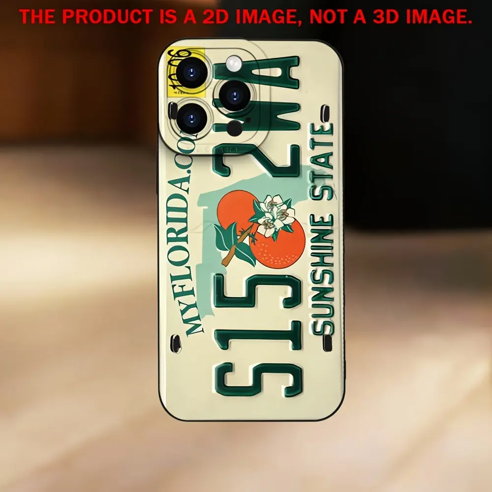
Florida Sunshine Phone Case
A place-led design with a cream ground and warm plate-inspired typography rather than a crowded collection of beach symbols.
View product details →Marine subject: let one creature carry the idea
The Tiny Olive Sea Turtle Phone Case takes a quieter route. Its name and current catalog image center a small marine subject rather than a full scenic panorama. A single recognizable animal creates an immediate point of focus, while open ground can make the design feel lighter and easier to pair with everyday clothes.
When comparing marine designs, notice how much habitat surrounds the animal. One turtle or whale reads more like an emblem. A reef filled with plants and several species feels immersive and detailed. Neither is more authentically coastal; they simply ask for different amounts of attention. Choose the subject-led version when you want meaning without a highly active pattern.
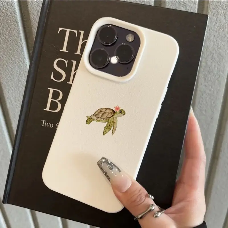
Tiny Olive Sea Turtle Phone Case
A small sea-turtle subject gives the ocean theme one clear focal point and leaves the surrounding design visually quieter.
View product details →Shell texture: treat it like abstract color
The Iridescent Abalone Ocean Shell Phone Case translates the coast through layered, fluid color rather than a literal destination or animal. Its shell-like composition can read as mineral, marble or water depending on the surrounding light and accessories. That ambiguity makes it useful for someone who likes coastal influence but does not want the phone to announce a location.
Iridescence already contains visual movement, so the rest of the styling can stay simple. White, black, denim, silver and one repeated blue or green are enough. Adding several other reflective accessories may move the look from subtle shimmer to deliberate maximalism. Both can work; decide which role the phone should play before adding more shine.
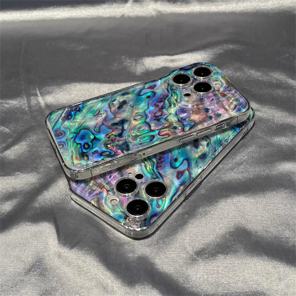
Iridescent Abalone Ocean Shell Phone Case
A shell-inspired field of fluid, iridescent color that works more like an abstract accessory than a souvenir graphic.
View product details →Use palette second, not first
Coastal does not require bright blue. Warm cream and orange can carry sun and road-trip energy. Olive and pale neutrals can make marine life feel quiet. Blue-green, pearl and metallic color can suggest a shell surface without showing water at all. First choose the visual language; then check whether its palette has a relationship to what you already carry.
The easiest test is to place the product image beside your everyday bag, favorite denim and most-used jewelry. Repeat one element, not all of them. The Florida case may answer tan leather or warm sneakers. The turtle case may connect with olive, cream or natural canvas. The abalone design may echo silver hardware or a single cool-color accent. The Mood In Case color guide offers a fuller wardrobe-based method.
Check the product page before deciding
A theme is only half the choice. Open the product detail page and confirm the exact supported phone model, available case color, live price and product image. Borders, camera openings and visible hardware can change the balance of a design. A dark edge may frame pale artwork more sharply; a light edge can keep a coastal palette softer.
Mood In Case product pages show the current verified options and direct PayPal checkout. Standard U.S. shipping is free, applicable sales tax is included in the displayed price, and eligible returns follow the published 30-day return policy. Use those live pages as the source of truth rather than assuming every design shares the same variants.
When your own travel photo is the better answer
A catalog design expresses a mood. A personal photograph records one particular shoreline, person or trip. If the location itself matters more than a generalized coastal feeling, use the original photo. Choose an image with a clear horizon, enough resolution and room to crop around the camera corner. Avoid placing a face, small boat or important landmark directly where the camera opening will sit.
The travel and photo case guide explains source-image selection, while the photo-resolution guide helps you judge whether the file can tolerate a full-case crop. Then use the Mood In Case DIY Studio to select the exact model and preview the composition.
The designer's conclusion
Choose a place graphic when the memory or identity of a destination is the point. Choose a marine subject when one creature or ecosystem gives the design meaning. Choose shell texture when you want coastal color without a literal scene. A coastal phone case stops feeling like a souvenir when its visual language already belongs in the way you dress and carry things.
COASTAL PHONE CASE FAQ
Useful answers before you choose
What makes a phone case look coastal?+
A coastal case can suggest a place, a marine subject or a natural shell-like surface. The common element is not one shade of blue; it is a visual connection to shoreline light, sea life or materials shaped by water.
How do I keep a coastal phone case from looking like a souvenir?+
Choose one specific visual language and connect it to colors or textures you already wear. A restrained place graphic, a single marine subject or an abstract shell surface usually integrates more easily than a case combining every beach symbol at once.
Is an ocean phone case easy to style?+
It can be. Cream and warm sunset colors work with tan, white and faded denim; marine blue works with navy, silver and cool neutrals; iridescent shell color works best when the rest of the accessories stay simple.
Can I use my own beach photo on a phone case?+
Yes. Choose an original high-resolution photo with enough space to crop around the camera opening, then preview it on the exact phone model in Mood In Case DIY Studio.