To choose a phone case color you will keep enjoying, find the colors you repeat, decide how much contrast you normally wear and treat the phone as part of your everyday accessories. Matching every outfit is unnecessary. Visual consistency comes from a small recurring relationship: blush beside warm neutrals, blue beside denim, or black and white beside silver hardware.
Read the colors you actually repeat
Start with evidence from your own closet rather than a favorite color in isolation. Pull out the jacket, bag, shoes and jewelry you reach for most. The useful clues are not only the largest areas of color. A pale pink manicure, cool-blue denim, black bag strap or white sneaker can give a case something to answer. Repetition across small objects is enough to make a color look intentional.
Separate your wardrobe into three rough groups: warm neutrals such as cream, camel and chocolate; cool neutrals such as gray, navy and washed denim; and strong accents such as cherry red, cobalt or bright pink. You do not need an exact count. Look for the group that appears on ordinary days, not only in occasion outfits. A case lives in your hand, on a desk and beside a bag every day, so the everyday palette is the honest one.
Use blush as a softened accent
Blush is useful when you want color without a hard break. It sits close enough to cream, beige and warm gray to feel calm, but it still registers as a choice. The trick is to avoid forcing every pink in the outfit to match. A case can carry several related pinks while the rest of the look supplies only one small echo.
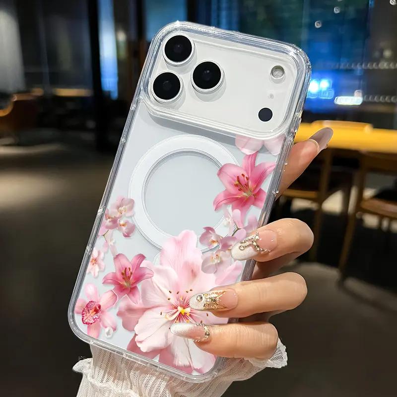
Blush Floral Cascade Magnetic Phone Case
Transparent space, pale blossoms and a few stronger pink lilies turn blush into a layered accent instead of one flat color.
View product details →The Blush Floral Cascade makes this relationship easy to see. Pale blossoms occupy the quiet end of the palette; the deeper lily centers provide punctuation; clear areas allow the phone beneath to remain part of the composition. With cream knitwear or a tan bag, the case reads as a soft accent. With black clothing, the same pink becomes more graphic. The design has not changed—only the amount of contrast around it has.
This is a useful choice if you often wear warm neutrals, rose-gold or gold-toned details, natural nail colors or muted florals. It is less convincing if you dislike decorative motifs and normally choose severe, solid accessories. Color cannot compensate for a visual language that does not feel like yours.
Treat blue like denim, not a special occasion
Blue cases are sometimes judged as though they must match a blue outfit. In practice, denim has already made blue behave like a neutral in many wardrobes. A navy, cobalt or porcelain blue case can connect with jeans, chambray, a striped shirt or even the cool cast of silver jewelry. That makes blue especially useful for someone whose closet is neutral but not warm.
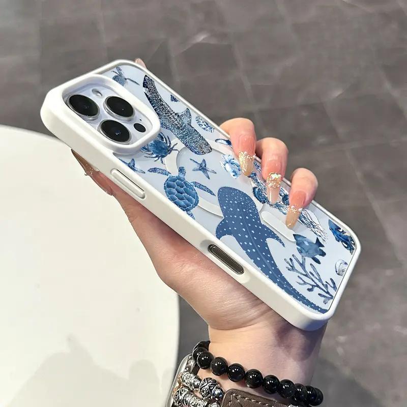
Ocean Whale & Turtle Magnetic Phone Case
Deep marine blue shapes, small botanical details and a light ground create a porcelain-like contrast rather than a single block of blue.
View product details →The Ocean Whale & Turtle design works because its blue is distributed across recognizable shapes instead of filling the whole case. The light ground keeps it crisp, while the large whale and ray give the eye somewhere to settle. Beside medium-wash denim, the color repeats naturally. Beside an all-black outfit, the white-and-blue case becomes the bright object. Beside a patterned blue shirt, however, it may compete unless the shirt pattern is much smaller or quieter.
Use the pattern test before buying: imagine the case beside the busiest piece you wear weekly. If both have similar-size motifs and equal contrast, they will argue. If one pattern is dense and the other has larger, clearer shapes, they can coexist. The goal is not color matching; it is deciding which object gets to speak first.
Choose black and white for shape, not invisibility
Black and white are often called safe, but a high-contrast pattern is not visually quiet. It may coordinate with many colors while still becoming the first thing someone notices. That distinction matters: versatility describes the number of palettes a case can join, while subtlety describes how much attention it takes inside each one.
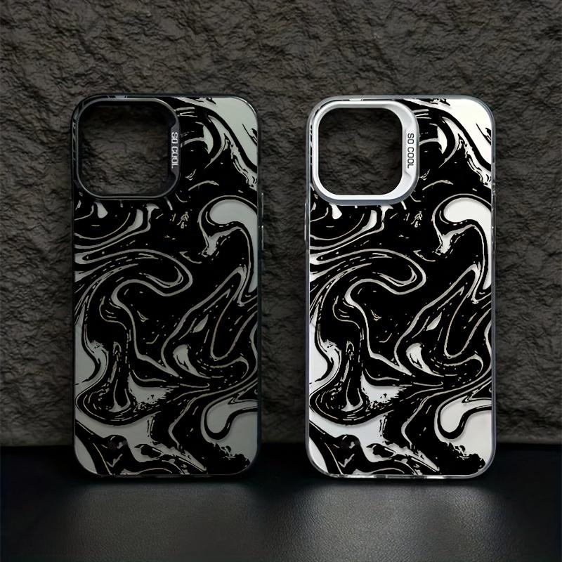
Monochrome Liquid Marble Phone Case
Large black-and-white currents create continuous movement, with the phone-frame option changing the edge from dark to light.
View product details →The Monochrome Liquid Marble case is color-flexible but not minimal in energy. Its broad swirls create movement across the entire back, and the dark and light areas keep trading visual weight. It works well when your clothing is solid, your bag has clean lines or your jewelry is mostly silver-toned. With another high-contrast print—large stripes, zebra or checkerboard—the effect becomes deliberately maximal rather than neutral.
If you want black and white to recede, choose more open space or a smaller repeat. If you want it to act like graphic jewelry, larger movement is the point. Check the available case-color and phone-model options on the product detail page; the frame around a pattern can change whether the design feels anchored in black or lifted by white.
Let the phone color participate when the case is clear
A transparent case is not colorless. The phone's finish becomes one of the largest color fields in the design, and a visible magnetic ring can become another graphic shape. A pale phone behind blush flowers will look quieter than a dark phone behind the same artwork. Product photography can show the printed design and case edge, but your own phone color still affects the final relationship.
For a clear or partially clear design, compare three things on the exact product page: the printed colors, the available case-border color and your phone finish. If one of them is dominant, let the other two support it. When all three are strong and unrelated, the result can feel busier than the catalog image suggests. If you are creating your own design, the custom artwork guide explains how artwork scale and background treatment carry into the case preview.
Use a one-week accessory test
Before deciding, save screenshots of two or three cases and place each beside a week of real outfits—not imagined future versions of your style. Include a workday, an errand day and the outfit you wear when you want to feel put together. Then ask three questions: does the case repeat anything already present, does it create the amount of contrast you enjoy, and does its pattern still feel right beside your busiest regular outfit?
Eliminate the option that needs the most explanation. A good everyday case should not require a new wardrobe or a perfect color match. It should make sense next to the objects you already carry. If two choices remain, decide whether you want the phone to blend into your accessory system or become its focal point.
The lasting choice is a relationship, not a neutral
A phone case color lasts when it has a dependable relationship to your life. Blush can soften warm neutrals, blue can behave like denim, and black-and-white can provide graphic structure across many palettes. None is universally safest. The better answer is the one that repeats your real colors at the contrast level you already enjoy.
PHONE CASE COLOR FAQ
Useful answers before you choose
What phone case color goes with everything?+
Black, white and clear are flexible, but the most useful choice is often a color already repeated in your wardrobe. A familiar blush, navy or cream can coordinate as easily as a conventional neutral.
Should my phone case match my phone color?+
It does not have to. A clear area can let the phone color join the design, while an opaque or high-contrast print can make the case feel like a separate accessory. Check the exact product images and selected case color before buying.
How do I choose between a subtle and bold phone case?+
Notice whether your bag, shoes and jewelry usually blend with an outfit or create its focal point. Choose a low-contrast case if those accessories stay quiet, and a sharper pattern or color contrast if one accessory normally leads the look.
Can a colorful phone case work with a neutral wardrobe?+
Yes. Repeat one small color from the case elsewhere, such as blue denim, a pink nail color or a silver accessory. The repetition makes the case look connected without requiring a perfectly matched outfit.