Choose a bookish phone case by deciding what should read first: a specific reading world, a playful reader character or a bold story quote. A dark book stack feels genre-led, repeated ghosts with pink books feel light and whimsical, and oversized red lettering makes the message the whole composition. All three current examples below link to exact iPhone 17 Pro Max variants so you can compare the design before confirming your own model.
Start with the kind of reader signal you want
“Bookish” describes an interest, not one fixed look. Some readers want recognizable books and genre cues. Others prefer a small character that happens to be reading. A third group would rather carry a sentence that suggests curiosity and risk without showing a shelf at all. Separate those routes before comparing color or price.
Look at each design at roughly the size of the phone in your hand. If the details collapse into one central illustration, you are choosing a focal point. If many small figures stay visible, you are choosing a repeat. If the words remain dominant from a distance, you are choosing typography. That quick test is more practical than judging an enlarged product image alone.
Choose the book stack when genre is part of the mood
The Dark Romance Book Stack design uses a compact pile of dark books, small red roses and distressed lettering. In the catalog image, phrases on the spines and the larger words above and below make the reference direct. The image reads as one centered emblem rather than an all-over pattern.
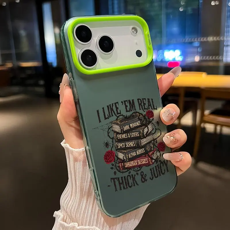
Dark Romance Book Stack Phone Case
A centered dark book stack, red rose accents and distressed lettering create the most literal reader-and-genre route.
View product details →This route works when you want the case to say more than “I read.” It points toward a particular dramatic, romantic atmosphere. Because the artwork is concentrated in the lower and middle area, the surrounding field matters too. In the current image it appears green-toned and dark, which makes the black lettering and red roses feel connected rather than scattered.
Choose it if you enjoy a case with one obvious subject and enough detail to reward a closer look. Do not use the photo to infer the case material, surface feel or protection level. Those facts are not established by the image. The exact product page is the place to confirm your available phone model, case color and current price.
Choose the reading ghost when you want a playful repeat
The Reading Ghost and Flower Pattern takes a lighter approach. Small white ghosts hold pink books across the case, with pink outlined flowers, stars and sprigs filling the open areas. No single ghost has to carry the whole idea. The reading cue appears through repetition.
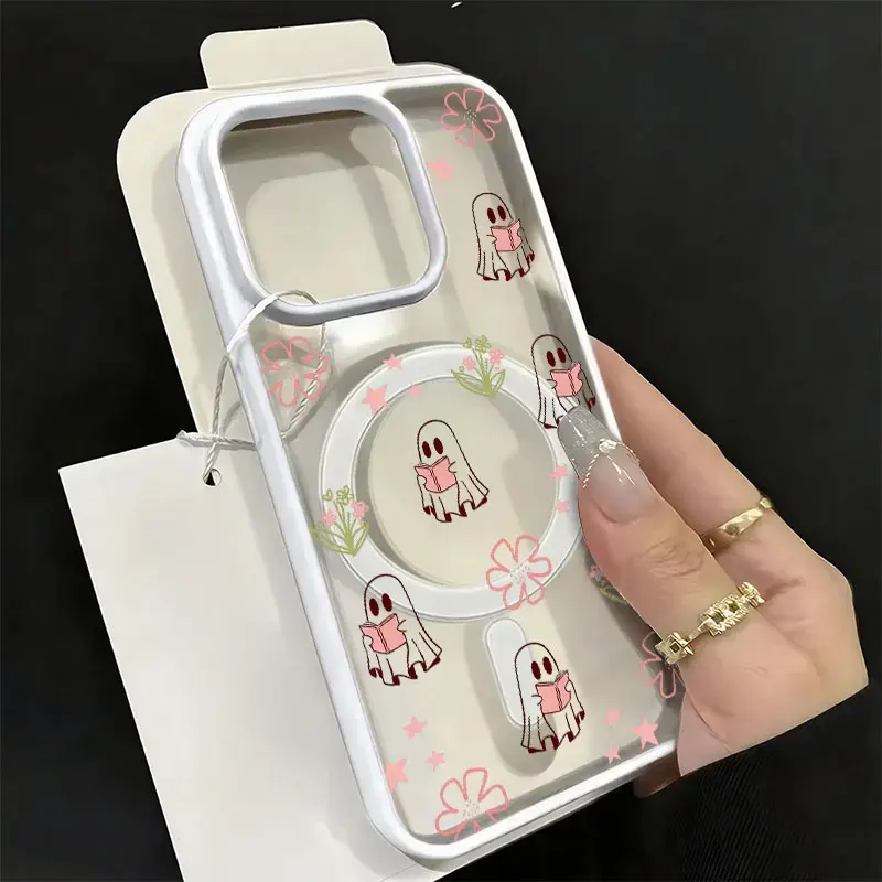
Reading Ghost and Flower Pattern Phone Case
Repeated reading ghosts, pink books and flower outlines make the bookish idea playful rather than genre-specific.
View product details →This is the easiest route when you like the activity of reading but do not want a case tied to one genre. At normal phone size, the eye notices several white figures and pink marks before it reads every tiny book. The pattern feels animated because the characters appear in different parts of the back rather than forming one centered block.
The product image also shows open, clear-looking areas and a visible circular element. Treat both as parts of the photographed composition, not promises about material or magnetic performance. If your phone color may remain visible through an available option, compare the exact product-page image and selected variant before checkout instead of assuming every model will look identical.
Choose bold typography when the sentence should lead
The No Risk No Story case removes books and characters entirely. Oversized red lettering fills the back with the phrase “NO RISK NO STORY.” The irregular letter shapes make it feel drawn rather than typeset, and the high contrast gives the message more visual volume than the two illustrated designs.
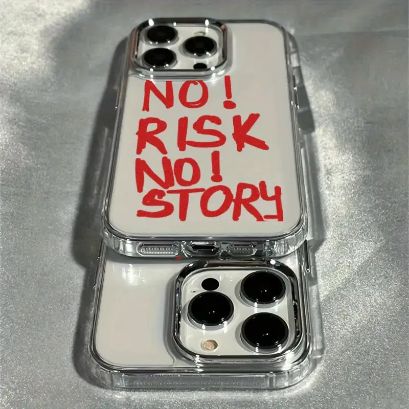
No Risk No Story Typography Phone Case
Large red hand-drawn-style lettering turns a story-minded phrase into the complete design.
View product details →Choose this route if you want a reading-adjacent idea without literal book imagery. It will read more like a graphic statement than a private detail, especially beside quiet clothing or a plain bag. The message is legible from farther away than the book-spine details in the first design, so it is also the least subtle of the three.
Check that you enjoy the full phrase, not just the red color. Typography stays present every time the phone is placed face down. Also inspect the exact model framing: a camera opening can change the balance around the first line even when the printed artwork itself is unchanged.
Use one three-question comparison before buying
First, what should a stranger notice at arm's length: books, a character pattern or words? Second, how much visual volume do you want beside your everyday colors: one dark focal point, many small pink details or a large red statement? Third, does the complete phone-model name on the product page match the device you actually own?
For a direct comparison, the current catalog lists the three linked iPhone 17 Pro Max variants at $6.97 USD each at the time of this review. Equal price makes the design decision clearer, but availability and price are revalidated before payment. If you own another model, select that exact model on each product page rather than assuming the same option exists.
You can also compare the colors against our phone case color guide, or use the meaningful gift guide if the case is for someone else. Shipping and returns are explained in the shipping policy and return policy. A bookish case is a style choice; it should not require guesses about fit, price or unsupported performance.
Pick the reading language you will still enjoy off the page
The dark stack is best when genre atmosphere is the point. The reading ghosts are best when you want a cheerful repeat with a quieter book cue. The red typography is best when a single line should lead the whole case. Decide which language feels most like you, confirm the complete phone model and exact variant, and let the product page—not an enlarged photograph—be the final purchase reference.
BOOKISH PHONE CASE FAQ
Practical answers before you choose
What makes a phone case look bookish?+
A bookish case can use literal books, a reading character or story-related words. Choose the route that matches what you want people to notice first rather than looking for one universal reader aesthetic.
Is a book-stack case easier to style than a typography case?+
It depends on contrast. The book-stack design uses a compact illustrated focal point, while the red typography fills more of the back. Compare each image at phone size beside the colors you wear most often.
Should I choose the case before checking my phone model?+
No. Confirm the complete model name, including Pro, Plus or Max, before ordering. The camera opening and proportions can change how the artwork is framed.
Do the clear-looking product images prove the case material?+
No. They show the visible catalog design only. Use the product page and checkout details for current options, price and availability, and do not infer material or protection performance from a photograph.