A retro phone case uses recognizable visual codes from an earlier era—analog hardware, arcade controls or high-contrast Y2K graphics—to make a modern device feel more personal. The most wearable choice repeats one clear idea instead of stacking every nostalgic reference at once.
Choose a visual language, not a decade label
“Retro” is too broad to be useful by itself. A payphone graphic and a hot-pink star print both look backward, but they communicate in different ways. The payphone is object-led: its buttons, labels and receiver create the interest. A handheld console is silhouette-led, because the controls and screen reorganize the rectangular phone into another familiar object. Y2K stars are pattern-led; repetition, contrast and color deliver the mood before you notice any single detail.
That distinction matters when you get dressed. Object-led designs behave like novelty jewelry and can sit against simple clothes. Silhouette-led designs want a cleaner outline around them, especially when carried in the hand. Pattern-led designs act more like a printed scarf or graphic bag: they need a little breathing room elsewhere.
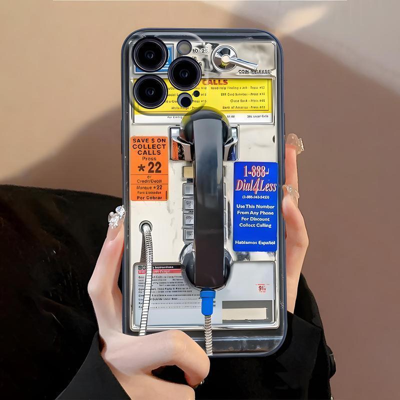
Vintage Payphone Graphic Phone Case
A dense analog composition built from the receiver, coin hardware, instruction labels and flashes of yellow, orange and blue.
View product details →Let the analog object be the odd thing out
The Vintage Payphone case is strongest when the rest of the look is current and controlled. The image already contains metal, black plastic, tiny lettering and several accent colors. Adding a full vintage costume—retro sunglasses, a slogan tee, a thrifted racing jacket and period sneakers—makes every piece compete for the same joke.
Try a black knit, straight denim and one small metal accessory instead. The black connects to the receiver, while silver jewelry echoes the hardware without copying it. If you prefer color, pull only one minor accent from the case. A cobalt sock, orange hair clip or butter-yellow bag is enough. The useful rule is one repeat, not a perfect match.
Use silhouette when you want the phone to become the accessory
A console graphic changes how the entire phone reads from a distance. Its red upper section, blue lower section and black controls create large color blocks, so the design remains legible even when the device is moving. That makes it a better choice for outfits with broad, simple shapes: an oversized blazer, a solid sweatshirt, a column dress or a workwear jacket.
Because the graphic is already symmetrical and highly structured, avoid surrounding it with several tight geometric prints. A narrow stripe can work; a checkerboard bag, striped top and patterned nails together will usually flatten the case into more visual noise. Give the console outline one quiet field and it becomes the intentional focal point.
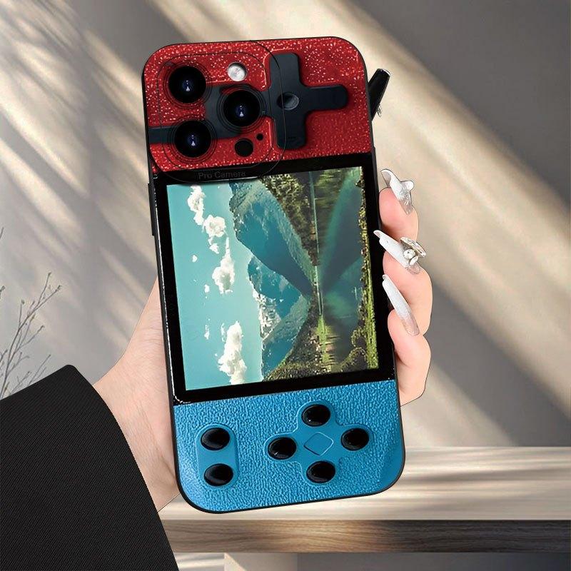
Retro Handheld Console Phone Case
A red-and-blue console illusion with a landscape screen and oversized controls that reads clearly from across a room.
View product details →Treat Y2K stars like a print, not a theme
Hot pink stars on black have a faster rhythm than the two object-based designs. The repeated outlines create movement, and the clear edge lets the phone hardware stay visible. This is the case to choose when you already wear silver, black, denim or sportier basics and want a concentrated hit of energy.
It does not need butterfly clips and a baby tee to make sense. A charcoal tank, loose blue jeans and a silver watch give the pattern a contemporary frame. For a softer contrast, pair it with a pale gray cardigan or washed denim rather than matching the pink exactly. The stars remain expressive, but the outfit does not become a reenactment.
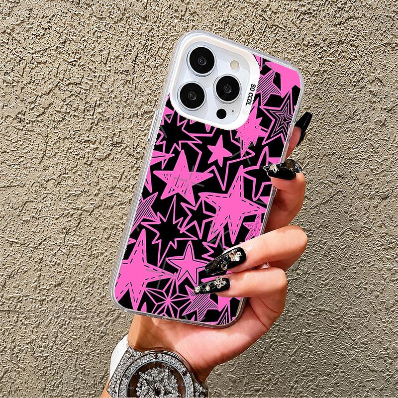
Pink Star Graffiti Phone Case
Layered hot-pink stars on black create a dense Y2K pattern, while the clear perimeter keeps the design visually light.
View product details →Use your everyday neutral as the background
Before choosing among these directions, look at the color you wear most when you are not trying to make an outfit. For many wardrobes that is black, navy, gray, cream or denim blue. That repeated neutral is the background against which the case will actually live. The payphone’s small warm labels stand out cleanly against black. The console’s red and blue blocks feel sharper against gray or navy. Pink stars gain useful contrast from washed denim and look more dramatic beside black.
This approach is more reliable than shopping for an imagined event outfit. Your phone appears with a grocery-run sweatshirt, a work bag and a coat far more often than it appears in a carefully themed look. Choose the case that makes those ordinary combinations feel a little more specific. If it only works with one planned outfit, the concept may be carrying more weight than the design can support.
Check the phone color and camera area
A case is never viewed as a flat print alone. The camera opening interrupts the artwork, and any clear sections bring the phone color into the palette. A black or neutral device tends to deepen a graphic; a light phone can add another bright shape around the lenses. Look at the current product image for your design, then imagine the camera cluster as part of the composition rather than an inconvenience outside it.
This is also where practical selection catches up with style. Use each linked Mood In Case product page to choose the exact model and available color. Do not infer fit from the number of lenses or the phone’s screen size. If the visual idea you want depends on a specific border or clear area, confirm that option before adding it to your bag.
When none of the catalog eras feels personal enough
Nostalgia does not have to come from a recognizable commercial object. A scanned ticket, a family snapshot, a childhood drawing or a photo of an old sign can carry a more specific memory. The Mood In Case DIY Studio lets you test your own image, while the photo resolution guide explains what helps an image stay usable at phone-case scale. Keep the same discipline: one strong source image, a deliberate crop and enough quiet space around the camera.
The design decision in one sentence
A retro phone case looks current when it is the only piece doing the time travel. Choose whether you want an object, a silhouette or a pattern; repeat one color somewhere small; and let the rest of the outfit provide contrast. The case will read as a point of view, not a costume.
RETRO CASE FAQ
Useful answers before you choose
What makes a phone case look retro?+
A retro phone case uses recognizable visual codes from an earlier era—such as analog hardware, arcade controls or high-contrast Y2K graphics—rather than relying on age alone.
Does a retro phone case need to match a vintage outfit?+
No. A retro case often looks more intentional with modern basics because the contrast gives the nostalgic graphic a clear role instead of turning the whole outfit into a costume.
How do I choose a retro phone case color?+
Repeat one color from the case in a small outfit detail, or pair a busy case with a quiet neutral. Exact color matching is less important than keeping the overall palette controlled.
What should I check before buying a retro phone case?+
Open the product page, choose the exact phone model, review the available color and current product image, and confirm the camera opening, price and delivery details before checkout.